
1. 使用openpyxl 制作excel折线图
1. 准备数据
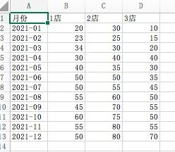
首先要准备数据,这次准备的数据是3家店铺在21年12个月份的销售额
from datetime import date

from openpyxl import Workbook
from openpyxl.chart import (
    LineChart,
    Reference,
)
from openpyxl.chart.axis import DateAxis

wb = Workbook()
ws = wb.active

rows = [
    ['月份', '1店', '2店', '3店'],
    ['2021-01', 20, 30, 10],
    ['2021-02', 23, 25, 15],
    ['2021-03', 34, 30, 20],
    ['2021-04', 30, 40, 40],
    ['2021-05', 40, 35, 30],
    ['2021-06', 50, 50, 35],
    ['2021-07', 50, 55, 45],
    ['2021-08', 55, 60, 50],
    ['2021-09', 45, 70, 55],
    ['2021-10', 60, 75, 50],
    ['2021-11', 55, 80, 55],
    ['2021-12', 50, 80, 70],
]

for row in rows:
    ws.append(row)

wb.save("线状图.xlsx")
生成的excel 如下图所示
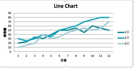
2. 制作普通折线图
for row in rows:
    ws.append(row)


c1 = LineChart()
c1.title = "Line Chart"         # 标题
c1.style = 15                   # 风格
c1.y_axis.title = '销售额'       # x轴
c1.x_axis.title = '月份'        # y轴

data = Reference(ws, min_col=2, min_row=1, max_col=4, max_row=13)    # 数据区域
c1.add_data(data, titles_from_data=True)        # 从数据中提取标题
ws.add_chart(c1, "A15")         # 设置chart 左上角的位置

wb.save("线状图.xlsx")
实际效果
可以通过设置width和height属性来调整chart的大小
c1.width = 20           # 设置宽度
c1.height = 10          # 设置高度
2.1 设置线的形状,颜色
data = Reference(ws, min_col=2, min_row=1, max_col=4, max_row=13)    # 数据区域
c1.add_data(data, titles_from_data=True)        # 从数据中提取标题

s1 = c1.series[0]   # 第一条线
s1.marker.symbol = "triangle"           # 节点出的形状  三角形
s1.marker.graphicalProperties.solidFill = "FF0000"              # 填充颜色
s1.marker.graphicalProperties.line.solidFill = "FF0000"         # 填充颜色

s1.graphicalProperties.line.noFill = True

s2 = c1.series[1]
s2.graphicalProperties.line.solidFill = "00AAAA"
s2.graphicalProperties.line.dashStyle = "sysDot"        # 设置线的形状 点状
s2.graphicalProperties.line.width = 100050      # 设置线的宽

s3 = c1.series[2]
s3.smooth = True        # 让线条看起来顺畅
s2.graphicalProperties.line.solidFill = "228b22"        # 设置成绿色

ws.add_chart(c1, "A15")         # 设置chart 左上角的位置
wb.save("线状图.xlsx")
效果图
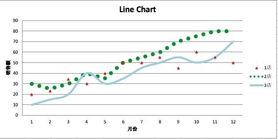
颜色的设置使用的十六进制颜色代码。
2.3 设置字体和大小
y轴的title 字体太小了,看着好难受,调整一下
c1 = LineChart()
c1.title = "Line Chart"         # 标题
c1.style = 15                   # 风格
c1.y_axis.title = '销售额'       # x轴
c1.x_axis.title = '月份'        # y轴

cp = CharacterProperties(ea = Font(typeface= u'微软雅黑') ,sz=1400)
c1.y_axis.title.tx.rich.p[0].pPr.defRPr =cp
需要引入的模块是
from openpyxl.drawing.text import CharacterProperties,Font
呈现出的效果
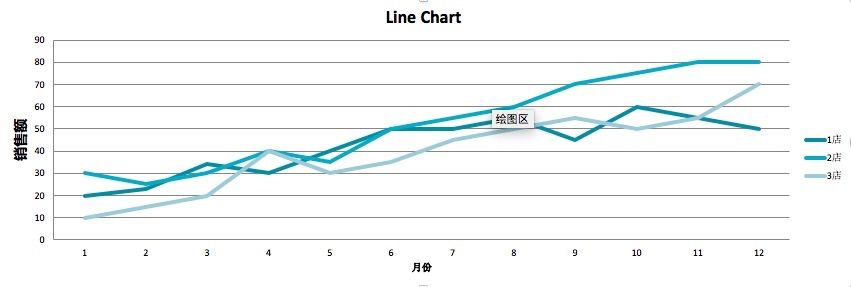
y轴的标题比前面示例中的已经大了很多。
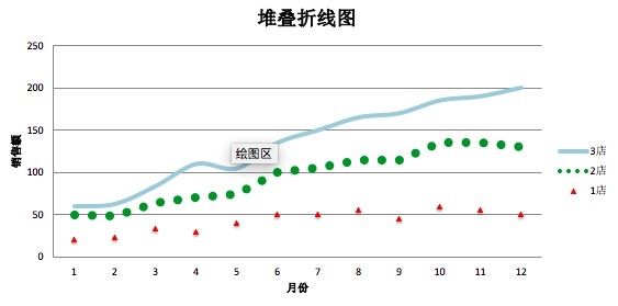
3. 堆叠折线图
制作堆叠折线图,需要设置grouping属性为stacked
from copy import deepcopy

stacked = deepcopy(c1)
stacked.grouping = "stacked"
stacked.title = "堆叠折线图"
ws.add_chart(stacked, "A36")
ws.add_chart(c1, "A15")         # 设置chart 左上角的位置
效果图
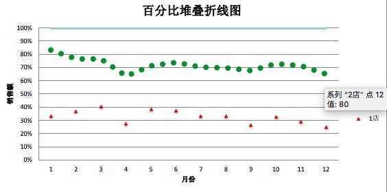
4. 百分比堆叠折线图
percent_stacked = deepcopy(c1)
percent_stacked.grouping = "percentStacked"
percent_stacked.title = "百分比堆叠折线图"
ws.add_chart(percent_stacked, "A58")
设置grouping 属性为percentStacked
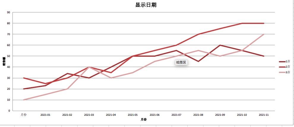
5. 让x轴显示月份
c2 = LineChart()
c2.title = "显示日期"
c2.style = 12
c2.y_axis.title = "销售额"
c2.y_axis.crossAx = 500
c2.x_axis = DateAxis(crossAx=100)
c2.x_axis.majorTimeUnit = "months"
c2.x_axis.title = "月份"

c2.add_data(data, titles_from_data=True)
dates = Reference(ws, min_col=1, min_row=1, max_row=13)
c2.set_categories(dates)
c2.width = 35
c2.height = 15
ws.add_chart(c2, "A80")
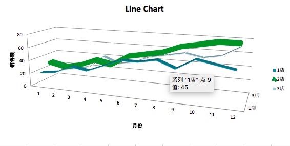
6. 3D 折线图
from openpyxl import Workbook
from openpyxl.chart import (
    LineChart3D,
    Reference,
)
from openpyxl.chart.axis import DateAxis

wb = Workbook()
ws = wb.active

rows = [
    ['月份', '1店', '2店', '3店'],
    ['2021-01', 20, 30, 10],
    ['2021-02', 23, 25, 15],
    ['2021-03', 34, 30, 20],
    ['2021-04', 30, 40, 40],
    ['2021-05', 40, 35, 30],
    ['2021-06', 50, 50, 35],
    ['2021-07', 50, 55, 45],
    ['2021-08', 55, 60, 50],
    ['2021-09', 45, 70, 55],
    ['2021-10', 60, 75, 50],
    ['2021-11', 55, 80, 55],
    ['2021-12', 50, 80, 70],
]

for row in rows:
    ws.append(row)


c1 = LineChart3D()
c1.title = "Line Chart"         # 标题
c1.style = 15                   # 风格
c1.y_axis.title = '销售额'       # x轴
c1.x_axis.title = '月份'        # y轴
c1.width = 20           # 设置宽度
c1.height = 10          # 设置高度

data = Reference(ws, min_col=2, min_row=1, max_col=4, max_row=13)    # 数据区域
c1.add_data(data, titles_from_data=True)        # 从数据中提取标题

s1 = c1.series[0]   # 第一条线
s1.marker.symbol = "triangle"           # 节点出的形状  三角形
s1.marker.graphicalProperties.solidFill = "FF0000"              # 填充颜色
s1.marker.graphicalProperties.line.solidFill = "FF0000"         # 填充颜色

s1.graphicalProperties.line.noFill = True

s2 = c1.series[1]
s2.graphicalProperties.line.solidFill = "00AAAA"
s2.graphicalProperties.line.dashStyle = "sysDot"        # 设置线的形状 点状
s2.graphicalProperties.line.width = 100050      # 设置线的宽

s3 = c1.series[2]
s3.smooth = True        # 让线条看起来顺畅
s2.graphicalProperties.line.solidFill = "228b22"        # 设置成绿色

ws.add_chart(c1, "A15")         # 设置chart 左上角的位置
wb.save("线状图.xlsx")

扫描关注, 与我技术互动
QQ交流群: 211426309